The MoMA App
2023

Project Duration
3 months
My Roles
UX Designer
Visual Designer
My Skills
Conduct User Research
Ideate Design Ideas
Create & Test Prototypes
Project Overview
About MoMA
The Museum of Modern Art (MoMA) is an art museum located in New York City. It is well-known for its broad and high-quality modern and contemporary art collections. In 2023, MoMA was visited by over 2.8 million people, making it the 6th most visited museum in the US.

The Problem
MoMA does not offer an engaging mobile experience for its visitors. It leaves visitors to rely on a mobile website that is difficult to access exhibit information, navigation, and personalized content. This situation has hindered the visitors’ interactive mobile experience both inside and outside of the museum.

Home Page:
inefficient page layout

Navigation Bar:
Important links hide in hamburger menu

Map:
Opens up a pdf file. Seriously?

Audio Guide:
minimal controls over the audio
Hypothesis
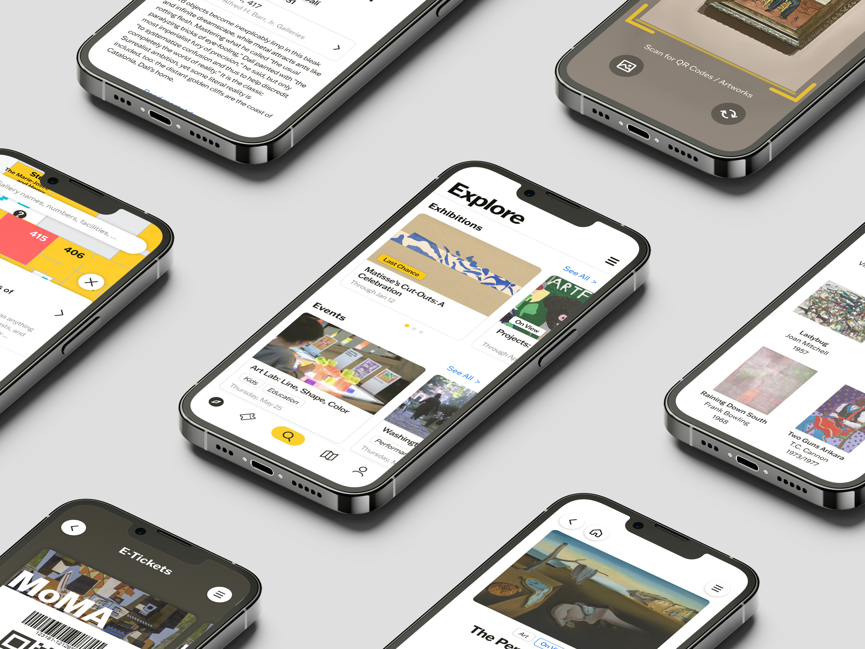
A possible solution to the problem will be a dedicated MoMA mobile app that integrates museum content, navigation, personalized experiences, and entertainment. This solution will enhance the interactive experience for visitors inside and outside the museum, and will deepen their connections with MoMA and its mobile app.
Design Process

User Research

Overarching Questions - User Research
- What content or functionality do visitors think are the most important to them while visiting or preparing to visit MoMA?
- What are the key challenges users encounter when accessing content or features when using the MoMA website?
The user research is conducted via an online survey (50+ sample size) and interviews (4 sample size). The survey and interview questions are designed based on 3 aspects:
- User Behavior & Context
- Pain Points & Frustrations
- Feature Preferences & Expectations
Key Pain Points Discovered
1
Difficult to locate exhibitions, artworks, or facilities with non-interactive map.
2
The ticketing system is inconvenient.
3
Hard to navigate between webpages especially on a mobile device.
4
Hard to quickly see what’s new and upcoming at MoMA
Selected Survey Results
- Most participants have medium to high tech-savviness on smartphones.
- Around 55% participants visit MoMA primarily for new exhibitions.
- About 40% of the participants had a poor experience with the MoMA website on mobile devices.
- The top 3 features the participants use on mobile devices are accessing tickets, checking exhibitions or events, and using maps.
- All participants access MoMA's website at least once during a single visit to MoMA.


Selected Interview Quotes

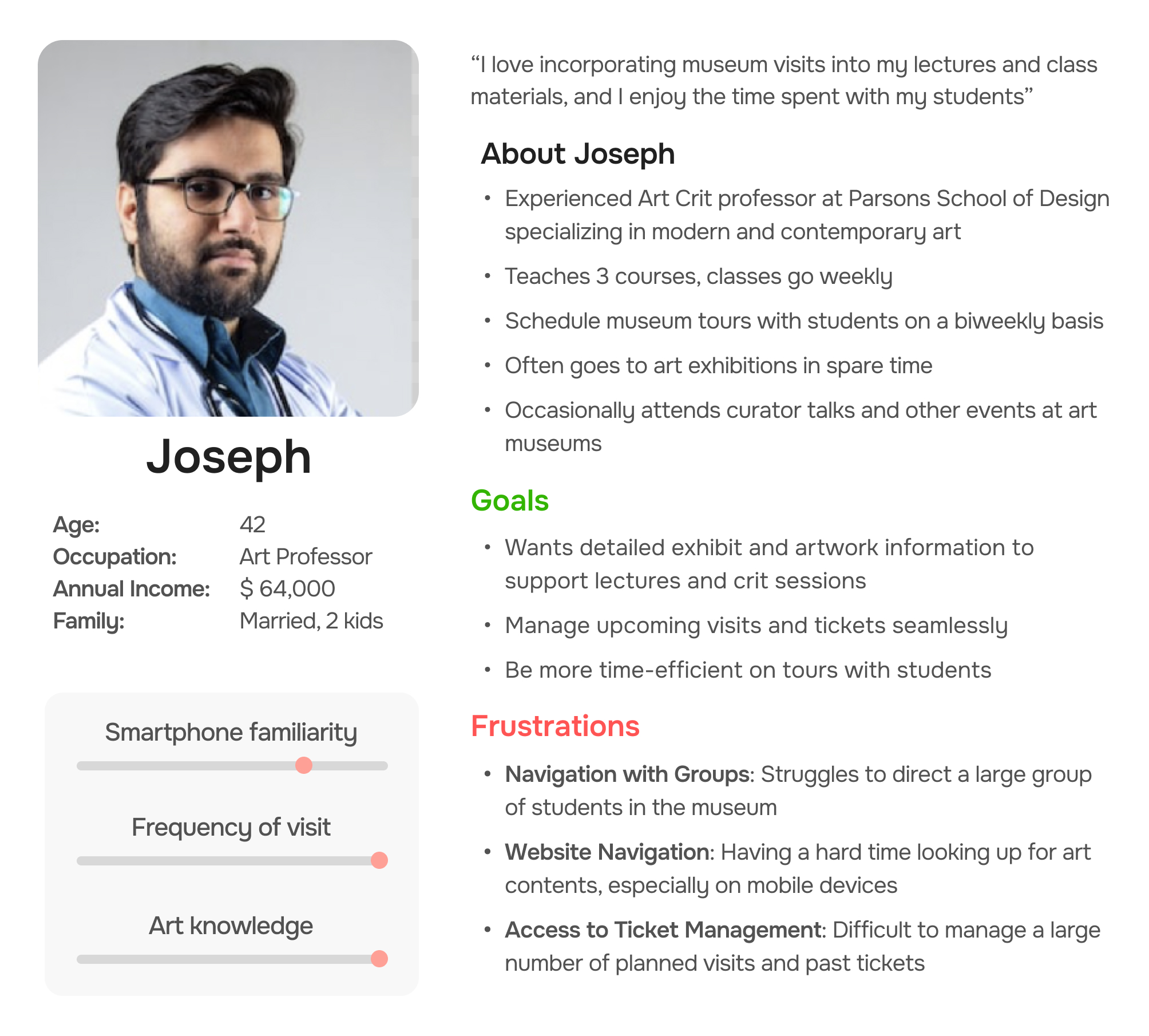
User Personas
User personas were created to synthesize the survey and interview insights into representative profiles, enabling a deeper understanding of the target audience's needs, behaviors, and expectations.


Ideation Process

Overarching Questions - Ideation
- How can I address the user's pain points and turn them into opportunities?
- How can I organize the information architecture of the app to let users navigate more easily and efficiently?
User Journey Maps
User journey maps aimed to understand the complete experiences my target users will have when visiting MoMA and interacting with its website.
Through the maps, I wish to further empathize the users’ pain points and their feelings at each stage of interaction, as well as underlying opportunities to solve their problems.

Storyboards
Storyboards are to envision how users would interact with the potential MoMA app at each stage of their experience when visiting the museum. This helped me identify users' needs, motivations, and potential obstacles they might face when using the app.


Information Architecture
I built the information architecture for the MoMA app to organize and structure its content, improving upon the information structure of MoMA's existing website. This ensures users can navigate the app more efficiently and find what they need.

Design Process

Overarching Questions - Design
- How can I lay out the interactive elements to ensure a smooth and intuitive experience while using the app?
- How can I design or improve the features to meet user's needs and successfully solve their problems?
Wireframes & Lo-Fi Prototypes
I sketched wireframes to visualize and test different design layouts of the MoMA app's user interface, labeling elements at each sketch that I thought would be effective with red stars. Then, they were transformed into low-fidelity prototypes to quickly test user interfaces. The purpose of this step was to preliminarily evaluate and iterate on design solutions before moving to high-fidelity prototypes.


Visual Identity Study

High-Fidelity Prototypes
The high-fidelity prototype integrates low-fidelity prototypes and the visual identity study to create a polished design. I aim to make it close to a finished product to recreate real-life situation. This approach ensures the user feeling fully immersed during the upcoming usability tests.

Usability Testing
I conducted usability testing on the high-fidelity prototypes to evaluate the current design's usability and user interaction. Through this process, I aim to uncover problems and opportunities for improvement in both the UI and user interaction.
I recruited 3 current users of MoMA's website for the test. Each of them were given a list of specific tasks to do or goals to achieve on the prototype. Their thoughts and feedback were then collected and analyzed.
Test Feedback

Final Design
Explore
Being the first page on the app, the Explore section allows users to browse various art-related content at MoMA. It prioritizes featured exhibitions and events, and allows users to browse the various artworks and artists.
Key UX Improvements
- Clearer and more organized content layout
- Prioritized user preferences
- Applied labels to provide clues to the main content
Tickets
On the tickets page, I aimed to create a seamless ticketing experience for MoMA visitors. I expect to enhance users' convenience and reduce their frustration in the ticket-purchasing and check-in process.
Key UX Improvements
- Seamless access to ticket check-ins in the app
- Payment information can be saved on account
- Allows users to manage past visits
Search / Scan
The Search/Scan page provides users with a easy way to find information. The new Scan feature allows quick access to related artwork content to enhance in-museum experience. I expect users to find the information they need effortlessly.
Key UX Improvements
- Search is now more discoverable to users
- Scan feature allows instant search results from scanning artworks
- Provides trending searches to help users discover popular topics
Map
The interactive map allows users to interactively zoom-in and -out, navigate to different floors, and check gallery details. Through this page, I aimed to improve the user's overall museum navigation experience.
Key UX Improvements
- Easier access to the map, eliminates redirecting to a PDF reader
- Users can now search on the map
- Better interactive experience, especially on checking gallery details
Me
This page allows users to manage their account settings. I expect to provide users more freedom to tailor the app and their account to their preferences.
Key UX Improvements
- New personalization feature allows users to save their favorite content
- Users can manage and save payment methods, saving time for future purchase
- Manage app notifications to their preference
Articles
Being one of the most important app components, each article page serves as a key destination in the user journey. An article could be about an artwork, an artist, an exhibition, or a gallery.
The articles contain essential yet detailed information for users' needs. They also further direct users to related content. I aimed to optimize the content layout and interactivity to ensure users a seamless and engaging experience while exploring museum content.
Key UX Improvements
- Article shows the location of the art on the interactive map
- More discoverable links to related content
- Quick access to the article's audio guide
- Audio guides now have control panels and can be minimized
Conclusion
Key Takeaways
Through developing the MoMA app, I learned how to create a user-centered design by focusing on user needs. Through user research, I discovered key frustrations among visitors and website users. Then, user journey maps and storyboards helped me empathize with their pain points and expectations.
Translating these insights into initial design solutions, I refined the app’s features, usability, and engagement through user testing and feedback. Eventually, I have solved the problems and created a more engaging mobile digital experience for MoMA visitors.
This project reinforced the importance of iteration, data-driven decision-making, and aligning digital solutions with real user needs. I will carry these key principles into my future UX projects.
Product Gallery


